30 July 2012

Tasty Texture

By tasty, I mean something sensual, something that little more inline with something you can experience.

When we see and view art, we observe its visual features. Its appearance, its texture and paint strokes. But it's those hidden sensual features which help influence a greater experience of artwork itself, by involving all of the senses. 

My love of negative-white space, sometimes allows me to imagine the texture of different materials when I place my hand over the creative design for example. I like to imagine an imposed raised area as I press my hands across the work.

 Using negative white imagery on black background, particular in photography is best to simulate this strange tingling to the fingertips.


By cropping the work at the top, the viewer is unsure whether the work continues around the border. As a white line immediately touches the frame above, and thereby creates an imaginary shape at the viewers imagination requests. I love it. Going to use this design to cover a couple of books for college on my up coming year or so.

Some other negative white-space - http://chewingcans.blogspot.co.uk/2012/07/eco-pattern-reducereuse-and-recycle.html - enoji

Cant wait to show you the finished product!!!

Wont be able to reply for a couple of days, its ever so much hassle in resizing images to fit the small allowed file size to post on blogger. Blog soon!

Jack

29 July 2012

Slowly moving

One of those slow moving days again. 


When I say 'again', sometimes I assume you, the reader completely understand. However you could only imagine with the jest of empathy here and there. 


A relaxing day, less creative than many on the hike to achieving something interest to post here and there, but perhaps left for another day to create a jest of exciting work.


Work which isn't so based on short-hand art. Something long-term. Something lovely and enjoyable.


Keep ya' posted,


Jack

28 July 2012

photos contin -

another photograph to accompany a few of the other interesting and unusual set-ups.


This post may be bland, but I have passed my theory test today and it has been a great morning in Bristol. New and more interesting work to come, working on a portfolio cover! stay tuned if necessary aha.

Previous unusual pattern arrangement links...

Game of cards? 

Bit of Bob Marley per chance?

Jack

27 July 2012

LP - Bob Marley and the Wailers

This alternative Photograph is just that little bit different. Something alternative, by why? is is because it uses a LP? and the interest in vinyl is considered to be cool and retro in this day in age? I hope not.

 The image is more than that. Its not retro, but uses interesting objects to expose a point of view or direction by the viewer. The negative white black space as the LP reveals its texture only through the white glimmer from the light.


The circle (LP) is off center, to create a gritty feel for old skool objects. Objects which appeal to a majority of audiences in different ways, whether history or interest. This collection of objects does expose a thousand words, and sometimes more. As of course imagery is not limited by language, more so understanding.

The sensual detail of hands create this cold feel of vinyl across the fingertips of the viewer, capturing the texture from the dramatic exposure of this white glimmer discussed previously. Ever so sensual photograph, to be used and abused by Photoshops manipulative powers, and of course the mind of the creator and designer. Me.

Jack

26 July 2012

Photograph arrangement - Goodbye lemonade can

I took a couple of photographs yesterday of a small pattern using a few unusual items from around my room. 

Makes me feel like it is a game show, a presentation of spontaneous items from afar, how many can you remember, 20 seconds go! ect.


The arrangement consists of a print of a old world war poster, a selection of faced-down Tarot cards, a 'shot up' lemonade can and dice. 
The beautiful details of the Tarot cards remind me of a form of cultural china paintings on pottery. The use of this apparent style creates a cleanliness brought to the cards, emphasizing the palette of white in the image. The lighting was arranged adjacent of the table so it could create a differentiation between cards and the world war print beneath.

I am currently embracing my theory test over the next few days, so with the enjoyment of these photographs wish me the best of luck.

Thank you,

Jack

25 July 2012

Eco Pattern - Reduce,Reuse, Recycle

This continuous order of the projected values (media) of society influence our actions to  consume ourselves with products. This doesn't only damage the enjoyment of simple pleasures or our wallets; but our planet too!


The pattern design illustrates my design process in the following link below. It's interesting some advantages that software can have over traditional techniques, i like to combine multiple imagery by experimenting with the hidden incites of illustrator and little touches of photoshop here and there, to generate alternative ideas and compositions.

This is actually the first time also that I touched upon the pattern generator. Had such a interesting time with learning more about all of these tools. 

how I reached where I am now with this project - 

Jack

PS. Please feel free to ask permission for any of my work. Thank you


24 July 2012

Wrapping paper design

A small project of mine to create some personalized wrapping paper for presents or to coat the inside of a portfolio case. Had such great fun developing a creative pattern during this production. I have developed all of my productions in separate illustrator files, so check the link below to see how each symbol was created.

I wish to use this work to also propose an environment protection related advertisement, and to user this pattern as the background, hope it turns out okay!


I would love to print some of the paper off so I can document how it looks on presents! will have to update in the future and record it on my blogger so stay tuned.

I also decided to change the colour do create a more playful compliment to negative white space.

Links are as follows,


Jack

23 July 2012

Together we can!

Just a little graphic I made yesterday for a small project concerning the planet and the increase in C02 released into our atmosphere through many industrial practices and our own carbon footprint made in everyday life. 


The enviromental proposal in generally based, as the recycle sign was used to of course represent the cycle of man-made materials, to reduce unnecessary production.

cant wait to get this project all sown together now!

Jack


22 July 2012

Negative white space - Playing with Illustrator

I have included a couple of these negative white objects in illustrator to be apart of a wallpaper project for phones and computers, had such great fun testing my illustrator tools and learning all of those quirky keyboard shortcuts. The other imagery for the projects will be linked!


I think a main mountain to climb during projects which uses such monochrome content, is posing the question what and where should the white space be contained? how could the shapes be defined and been made to look more three-dimensional than the shapes originally illustrate?

Links to project design works:


enjoy you negative white space lovers aha

Jack

21 July 2012

Type for the nation


I love type, different text arrangements and Typography. It is only recently been advised to give this font a try, and you know what? I think you should give it ago too. The font is highly available online.


Its tasty because it is sensual. Typography could relate to the emphasis of an adjective, placed onto words using varied font styles. A common example could be how effective Gill Sans can portray speech in italics.

Excuse what may be a simple post of disinterest for some, as of course many of my interests may be distracted by a few exciting projects lined up for my creative progress! keep ya' posted.
Jack 

20 July 2012

Imaginative brief!

I made a excellent and of course unusually themed logo for a youtube account 'Taco Shack Studios'
They cover a large range of different gaming platforms and provide comical information. Briefly moving on, I am not much of a gamer myself unless I give making one ago aha, but I highly recommend checking their channel out.


This little and rather comical creation was made on illustrator, and the character and overall logo were made separately and brought together in one Jpeg file!

Had such great fun discussing the brief with the client, and had some fun bouncing across some ideas of a simple yet effective Taco cartoon. If you follow the link below you may be able to still see the original Taco Logo.

Enjoy!


Jack


19 July 2012

I love music

What way to advertise and promote live music than to cut out large bananas to stick on the walls of gigs and live music venues...


Had a great laugh with a friend at Costa today creating this banana shaped graphic. Great fun. 100% illustrator fueled imagery for the lively and musical masses. I'm looking at you!

Also, for those graphic interested people out there, check out this excellent Olympic Designer for the Munich Olympics in 1972.


Jack

18 July 2012

White space 2.0

Continuing from my previous car negative white space, I created a moped in a similar style. I wish to compose a repetitive pattern of the following negative white imagery upon mint green paper. 

This is far from a refinement, but I am happy to post my progress.


I used my lovely Illustrator package to compose this intricate shapes and figures to create this cartoon and simplistic image. I created this piece of work over night, so excuse me for the poor refinement. I used a reference image for the moped anatomy, but created the figurine by racking at my brains for ideas.

I really enjoyed this, and will soon compose a repetitive pattern on blogger to illustrate my refined simplistic characters to the world. I wish to produce this to create some nice present wrapping paper, or if I am happy enough to use it, to line my portfolio case. With much refinement I am sure to copose this haha.

For those who missed my previous post, here is a link!

enjoy!

Jack

17 July 2012

Man Stands

Man Stands and Walks alone.

The viewer feels as if he/she is walking behind the man, but truly the perspective lies to the viewer.

 The perspective no longer reveals that the viewer is even on the farming plain or otherwise. The viewer is a ghost, a ghost observing this lonely man and pleads sympathy, as well as other feelings presented in the heart of the viewer.


The bright colours of the blue sky make the man feel welcome to a new beginning. The blue sky is a calm contrast of brushstrokes in comparison with the crops and the wet earth in front of our lonely figurine. The sky almost reflects a water quality to it, calm, refreshing. as the man walks into this veil of refreshing sky. Life restarts from the mind.

I like to refelct the psychology of contemporary concepts in some of my work. 
As no longer are worried is postmodernic society of whether we will abide to stick to the traditional norms and values of society. But often based on the maintainence of emotional health, in various diverse forms and presentations, which differ from traditional life.

Expressed on the stage of life. (Shakespeare/with reference to Sociologist Erving Goffman and social roles.)

Jack

16 July 2012

The powers of White Space

One of my first projects on the new creative design and web Premium from Adobe and I am loving it!
I used Illustrator to compose this piece of work, almost creative this collage feel of paper on mint green card. I used a reference image to creative accurate shape details and simplified the wheels and windows to startle the viewer in whether the simplicity is intentional?


Going to have a go at creating my own wrapping paper with these beautiful negative-white space vehicles, and perhaps postcards also.

Still looking for an internship. It's tough.
Being a creative individual in the real world for now may have to wait, and though my skills may reflect dedication to design, I will have to develop my experience over a longer duration until industry may need me.

Jack

15 July 2012

Leaflet for the Arnolfini

The legendary Arnolfini exhibition space and arts center in Bristol has a excellent event to inspire college students to invest some time into these creative workshops illustrated below. Me and a friend helped with some of the Advertising, so if any of you bloggers or google+ Bristolians go, Ill catch you there aha!


Some information about The Arnolfini to infuse its creative juices with you. Excellent cafe also, good on the price.

Jack


14 July 2012

Perspective drawing

Just a little Sketch ink edit I rendered using 
0.05 and 0.5mm pens. I knwo this is a touch of a repost but I really enjoyed this outcome.


Just the manipulation of the two-point perspective continues to amaze me. Just creating control over what you can see, and what others see. Our eyes focus into the depth of the cityscape, though the drawing is on paper, creating a illusion for our own eyes, limited to the details of that drawing.


The Original post on 3D rendering robots, and similar projects a like.


Jack

13 July 2012

Graffiti Stencil - Jimi Hendrix

A little Jimi Hendrix Stencil I made some time ago. There is something magical about using stencils, that negative white (yellow) space is just perfect every time.


No photoshop here folks!

Had some great fun painting the stencil, the use of the paint can created these soft cheekbones, and this air brush effect to it all. The use of blue-tack can highlight important shape features which are necessary to remain carved from the portrait, like the features of nose and outer hair.

Jack

12 July 2012

beautiful design cover there Adobe!

My student Life is now complete. No longer having to evolve my skills using freeware, such as Indesigns' relative Scribus, and photoshops' cousin Gimp. I have finally saved the funds I need to purchase this holy grail of software. 

Adobe creative suite 6 design and web premium. Already I have discovered the wondered of flash and other unknown forms or 'spendy' complicated software. (which of course like many programs, will at first drive me up the walls).


I thank you for reading this disinteresting post, however to me this is a large achievement over the years. 

After purchasing the software from www.software4students.co.uk I found their advice very helpful. However, for many students out there like myself, I would ensure before purchase that you do not need the software immediately. Though you can utilize the 30 day trial, the product code that I had received from software4students was not valid on the adobe website. 

Nonetheless, simply file a case and adobe will send the serial number to your email doorstep, and everything will flow as it should. Though many software4student products do have good results. But in my case I was less successful in obtaining the software product code. Just a warning from any S4S purchasers, but not to worry, S4S has a very strong customer support communication. As they believed it was not the fault of my own or theirs, they helped me from there to validate my product, as well as the online adobe agents.

I can only assume that the mass leak of serial and product codes may lead to problems with official products. This may be a result of the amount of illegal software available on the net today, and the lack of internet power to stop it. 

Jack

11 July 2012

Curious boy paints the world

Based off of the '0.05 fine line' sketch that I had uploaded a couple of days ago. I illustrate whats really going on behind the computer screen, using a symbol/metaphor for the thoughts and creations, which are created from our minds and the good ole photoshop.

 It really enjoy the look of this image, with these contrasting reds and blues to bring these candy colours together. 


Jack

10 July 2012

Ink washes - Comic kid sketches and proposals


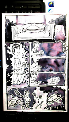
 Thought it would be of interest to see some of the traditional techniques I used before I 'shopped my work. The origional post is illustrated in colour for those which havent seen the final production. Listed below.

Makes me smile thinking back to this. A photograph with a small A4 drawing proped up onto the very laptop I am using. Taking many photgraphs to get the best focus without a interfeacne with a low shutter speed aha.

I remember remembering the breathing techniques in taking shots in a photography lesson. Breathe in. Hold breath. Take photo. It hardly works me, but with some trial and error I managed to prop the camera up, using the armchair like a pivot or rest spot for my elbow.

When It comes to comics I have great interest with this cytoplasm liquid, whether it is used in text, thought bubbles or borders. This graffiti styles goo' compliments my hand gestures when I draw, creating textured feelings when observing the work. Love it. http://chewingcans.blogspot.co.uk/2012/06/ink-textures-photoshop.html - Link


Jack

9 July 2012

The 0.05 fine line

When thoughts evolve.

It's just nice to sit back, relax and get working on some nifty cartoon works. The feel of the freedom of constructionist symbols and themes. Your drawing doesn't have to mean anything. Only personal work to entertain the mind or minds of friends and family. Clearing up the emotional clutter gathered from the day.


Had some great fun on this adventure through the mind using perspective lines and maintaining the two-point perspective of the illustration. I think i will attempt to photoshop it up a little and place some interesting painted textures to simulate this hand-painted feel.

Jack

8 July 2012

Sculpting Paper - The Self

Paper Sculpture


Paper is a easily accessible and versatile material and medium to sculpt, shape, fold and cut. Working with something which appears so familiar, brings a greater depth to how we perceive the normal and everyday objects. When previously discussing this in my blog I linked you to the work of Claus Oldenburg and superstructure of everyday objects, scaled to a greater scale. The links below will make sense of all of this aha. Anyway, It was last year when i created this over a four hour duration. Trying to capture those pockets of anatomical detail and shapes of my face. It was really fun to compare to how people in the group created their own faces. Should hair be cut into strands or remain sections and partings of hair similar to my own? It's simply amazing how this variation is a small incite to this mystery and difference between peoples perceptions. Peoples eyes, peoples thoughts and familiar functions. Human psychological brilliance!


Claus Oldenburg and a Informative Diagram post

Jack


7 July 2012

Illustration - Illustrative - Illustrated work

An Illustration for a now non-existent band Livewire which i had created back in the day. By back in the day I mean last year aha. Such a great fun handrawn/digital project.
The illustration was based off a Biro/fine-liner sketch and pumped up in the good ole photoshop. The use of this vibrant red against the turquoise background plays with they eyes of the viewer, immediately directing their eyes from center to the boundaries of the illustration. The subtle lines of sketch construction create this handmade feel, and create a more empathetic and worked atmosphere to the graphic.

I will upload some more colour styles which Had interested me the following couple of days.
Jack

6 July 2012

London 1.01


 London Film results continued.. 35mm F55 film camera. 


  The crew!


A couple of photographs which follow from the original post http://chewingcans.blogspot.co.uk/2012/07/bristols-pop-up-shop-college-green.html based on a volunteer group of young creators. Had a great time in visiting London with them all, the photographic experiences were just too much! I love this last one with the reflections of the concrete and the silhouette of people against the gleaming sunlight. Such a great day.

Jack

5 July 2012

London! - 35mm film F55 Camera

Some lovely Film results at a London trip early last month.


 On my visit to the Tate gallery, it had provided me with some interesting photographic opportunities to capture the sights and the visual sounds of the colourful London.

The movement of the heavy rail train across the cities. Capturing imagery like a flickering motion film. The pause and longing wait in our arms and legs, as the hours pass by in a singular seat.

The Sky was clear, and ideal to take a few snaps during the duration of my journey.
The shadows appeared harsh in the blaring sun. But created interesting silhouette effects, specifically in the Tate modern as demonstrated below with a slow-shutter speed. The gleaming sunlight off of the glaring sunlight bouncing around the Tate off hot concrete. Such a great day.

Jack

4 July 2012

Superman render - 3-D modelling

 Time to see what else is that there...


Move away form the creative suite for just a touch to experiment with alternative possibilities of graphic Design and digital art forms. Blender 3D was a main highlight to many graphic artists on youtube. It was interesting because, even though Blender was a free software program, the software was completely malleable to artistic form. Rendering, animations, game engines and physics simulators. Such a great touch of freeware, which can essentially produce realistic results when an individual has had some quality experience with the interface.

A few sketches of both the X and Y axis of my soon to become rendered superman model. I found that by using pencil to draw out the symmetry, I could develop a quick and easy reference image to place on the X and Y axis when modelling my figurine.


The hero was composed with it's limbs spread apart to create a clean, animated movement of objects when the model was parented to a skeleton. The construction of bones also comes to a great advantage to the maneuver of parts during animations or poses (in this case) in blender 3D.


I enjoyed the final outcomes of this experiement, though with great understanding I know how difficult it can be in hours upon hours of refining character shape, to produce a simple result. However, I found this beneficial to my knowledge of 3-D modelling techniques. I may wish to purchase official modelling software in the future, to help develop my skills as a malleable designer and graphic artist.


The relationship between sketch and model, overall came out very well. I could utilize Photoshop to adjust any measurements necessary to the refine the finishing touches of the figurine.
Blender also has great colour and material qualities. For example, I utilized the luminosity and intensity of the colours of the outfit, to reduce shadow from nearby lighting. Because of this, I could also utilize the reflection off of the building, as the spherical daily planet mirrors the background sky image and partially the superman figurine.


Final product . . .                                       Jack


3 July 2012

Bristol's pop-up shop - College green

A pop-up shop I helped to volunteer with at College Green and how successful it was to advertise the 'Raw Materials' gallery in Bristol museum and Art Gallery. These photos were taken during the set up of the shop. I took my F55 Nikon camera along on a few on the days after this day, and will provide more images once the film has developed! hope they turn out a.OK.


 Being paid in jaffa cakes, orange squash, cups of tea throughout the day, it was some tough work throughout. Almost just trying to find somehting to contribute to the enteratainment of the shop was probably most difficult. However, I can ensure you that it was a rather constructive experience. It was pretty comical, how because there was movment in this little green shop, how we had to fend off Art fanatics from entering to see what was going on aha. "come back next week!" "im not here next week I want to see whats happening!" - what a kerfuffle.


Lovely old-fashioned carpenter work, nice to see on the shops of town. It's rather practical with the PVC frames, but puts the carpenters out of business. Oh the over developed technologies aha. We had a lovely green framed shop to 'attract visitors attention' some say. I also displayed some of my work on the left there in that little A3 frame, ill link you to a closer view below. Had a great time during my experiences in working in this organization with my fellow student team 'young creators'.


Previous post on the pop-up shop and 'I' is for Intern references


The function of the pop-up shop was to advertise the http://www.facebook.com/events/464630226896615/ facebook event, so please attend if your a fellow type fanatic like myself aha.

Jack